
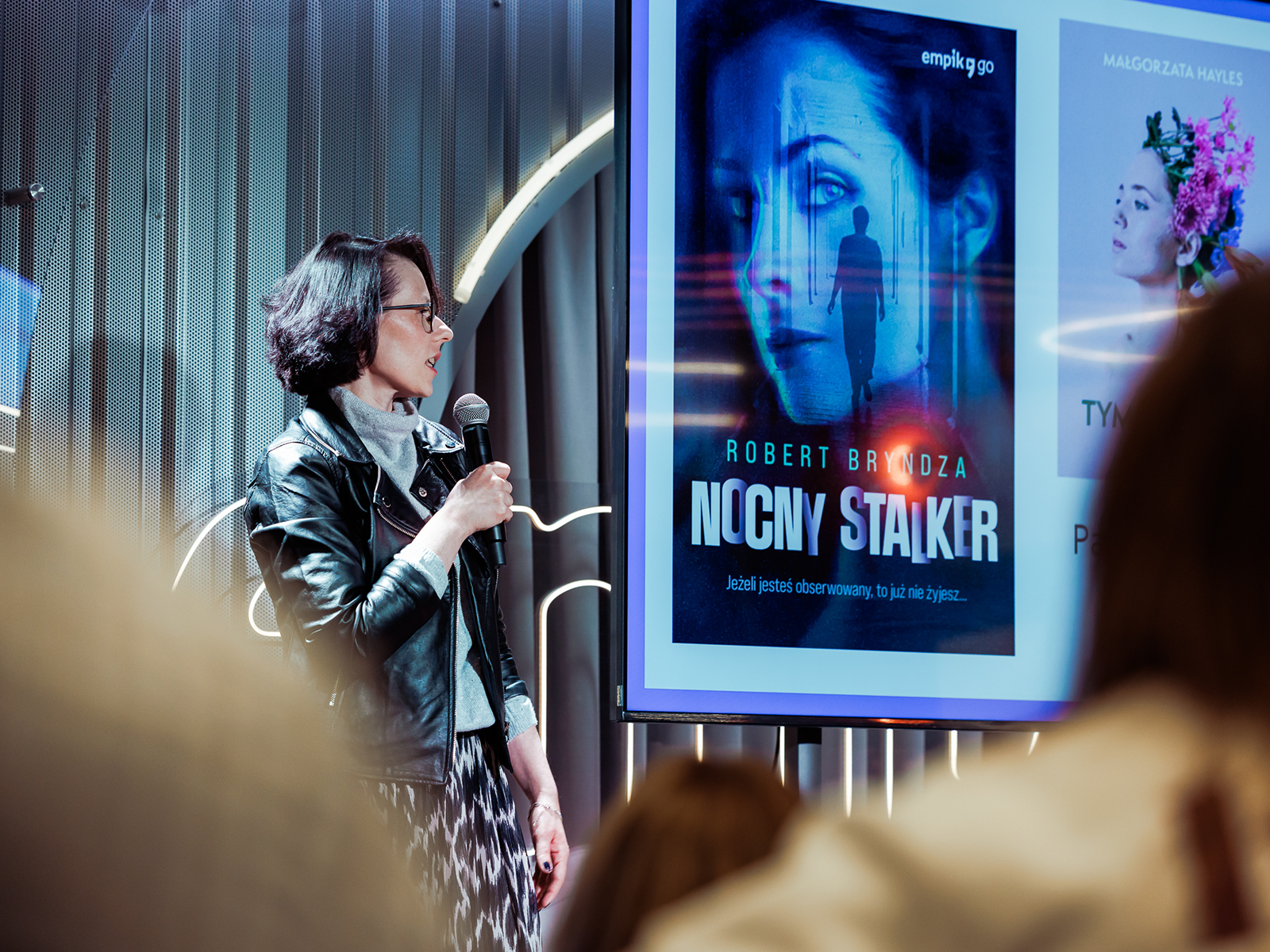
You won’t find a list of values here. Below are examples of how I think as a designer, what I pay attention to, and the principles that guide my work.
When a big promotion
isn’t enough
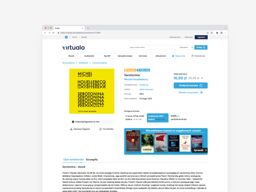
Virtualo, an online bookstore for ebooks and audiobooks, had a high cart abandonment rate. Even during major promotional campaigns, users were not completing their purchases. I start by slowing things down.
Before I design anything, I try to understand where people hesitate, what confuses them, and where the interface demands too much.
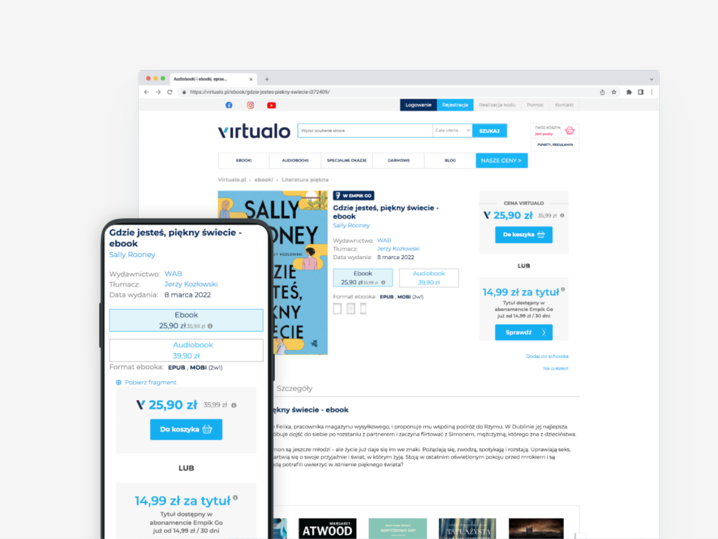
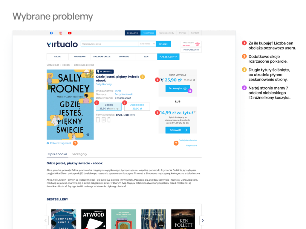
I conducted a thorough audit of the entire purchase flow and identified pain points at each step. The team originally hypothesized that pricing and promotional effectiveness were the main issues. However, the audit revealed different insights: the most significant barriers were information overload on the product page and a poor user experience on smaller screens.
Cart abandonment during promotions can indicate that the problem lies in the process itself.
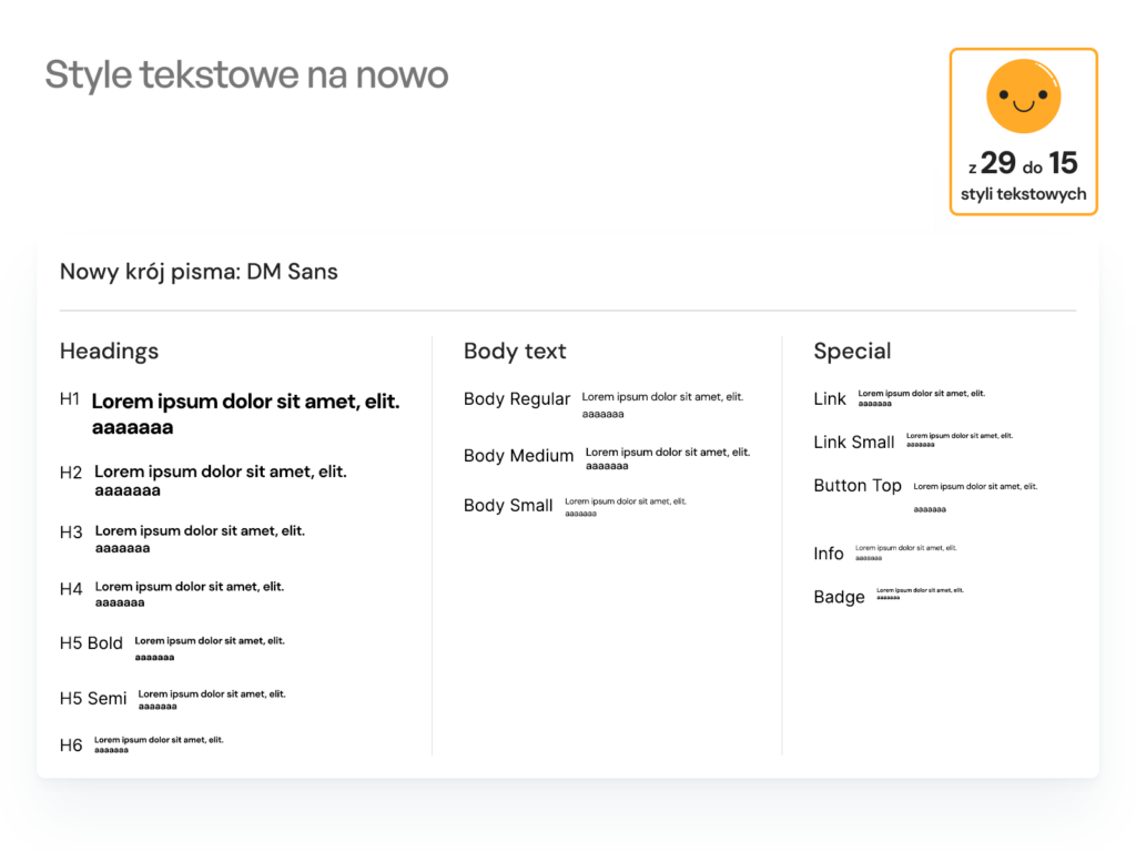
Based on the audit findings, I created a clickable prototype of an alternative purchase flow. Alongside changes to the information architecture, I also improved the product’s visual design. This included a new typography hierarchy, a more focused and consistent color palette, and clearer rules for presenting content across different screen sizes.
Accessibility starts with understanding
I conducted qualitative research with Empik Go app users, taking responsibility for participant recruitment, discussion guide preparation, session moderation, and analysis of the findings. One area of focus was research with blind and visually impaired users who relied on assistive technologies.
During my research, I spoke with someone unable to read for several months after eye surgery. That conversation changed the way I think about design and accessibility.
I don’t design for groups. I design for situations. Illness, injury, surgery, fatigue, or temporary limitations can affect anyone. That’s why I see accessibility not as an exception, but as a core design principle.
Design system
At Empik Go, I was responsible for developing the design system. Working on it taught me to think about design more in terms of rules and patterns than screens.
Consistent components and close collaboration with developers allowed us to move faster and reduce errors. We could solve problems at the system level rather than on individual screens. A design system is not a component library. For me, it’s a shared language for the team.
Standards in practice
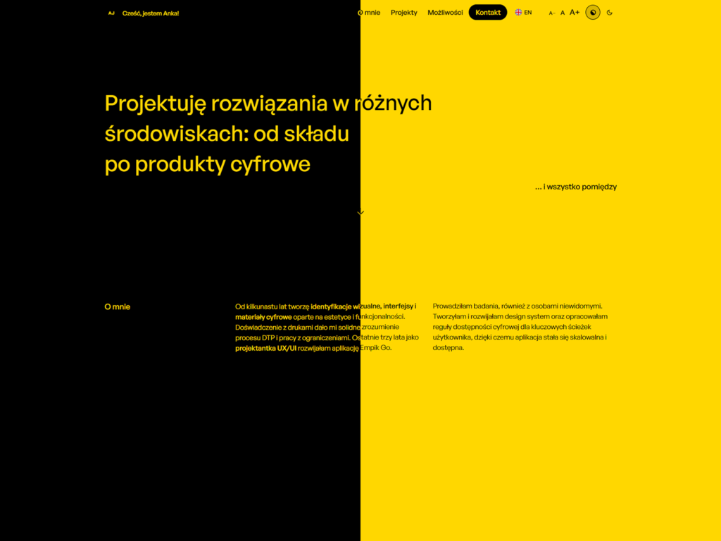
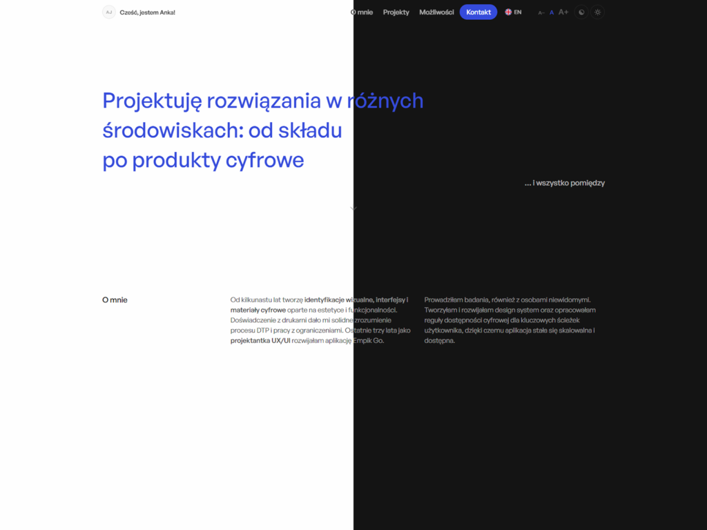
I can’t write about accessibility if my own website doesn’t live up to it.
This website is my design laboratory.
That’s why I treat ankajot.pl as a place to test my design assumptions and see how they hold up in practice. Every technical decision is intentional. I design for myself according to the same principles I apply when working with clients.
Looking for UX/UI Designer?
Contact me and I’ll prepare design that’s
effective and aligned with your business goals!