
Audiobook app
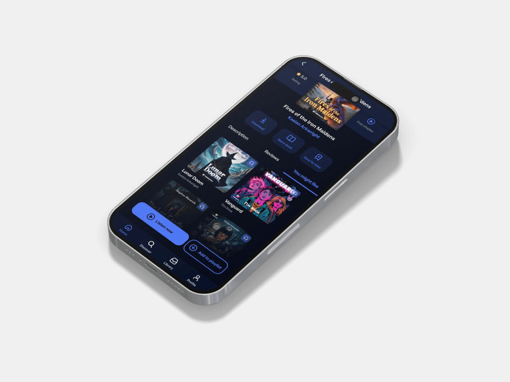
Overview
A concept project based on my experience working on a listening and reading app. I ran usability testing and in-depth interviews (IDI), analysing the needs and behaviours of users of audio and text content.
I am not presenting original product solutions. I created an app concept and a design system based on research findings to explore what designing from scratch could look like, without the constraints of an existing product.
My role
I was responsible for the full design process: from planning and running usability testing and IDIs, through analysing the collected data and identifying user needs, to designing the interface. In parallel, I maintained and developed the design system, which supported consistency across the solutions.
What I found
Finding the next title takes time and effort. Participants spent a lot of time looking for what to listen to next, and expected the app to shorten that process by making relevant suggestions.
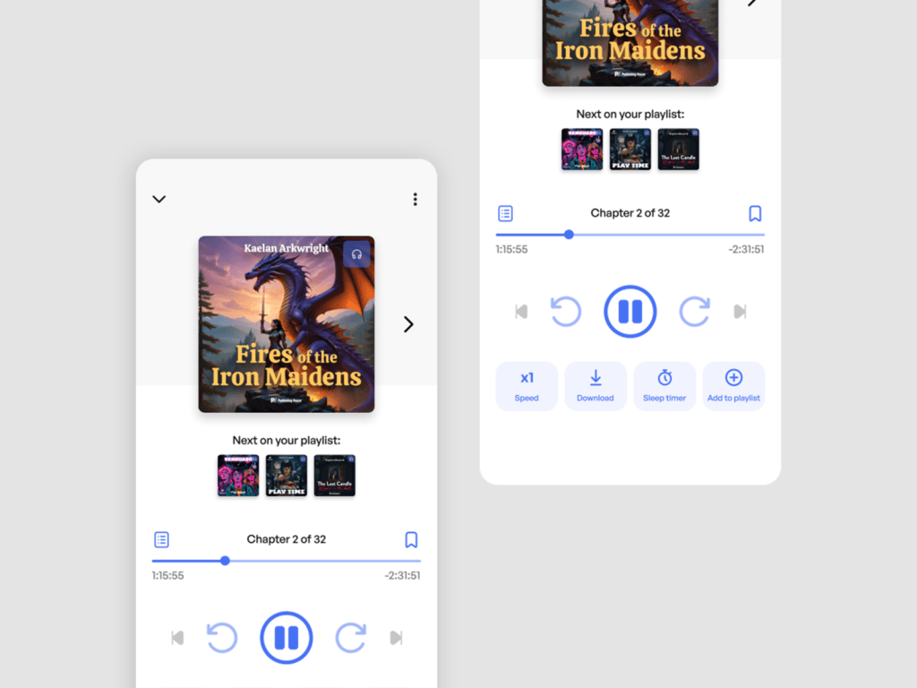
Lack of series continuity and a hidden queue cause frustration. Users did not always know what would play next, or that they could change the order. They lost track of the next parts in a series.
Ratings and recommendations influence choice, but trust is limited. Users check ratings and recommendations, but want to be able to dismiss suggestions that do not feel relevant.
Audiobooks and e-books often overlap. Some users regularly switched between content formats depending on the situation and place, for example listening while travelling and reading at home.
Users
People who listen to audiobooks mainly outside the home: on walks, during workouts or while commuting. Their priority is to start playback quickly and continue listening in as few steps as possible.
Readers who regularly switch between audio content and e-books, adapting the format to the situation and place. They expect a smooth transition and easy access to the same content, regardless of how they consume it.
Design decisions
Resume and continue. The most common first action is returning to the last listened-to title, which makes easy resuming important. After a title ends, the app suggests the next one, and the following parts of a series are shown directly on the title page.
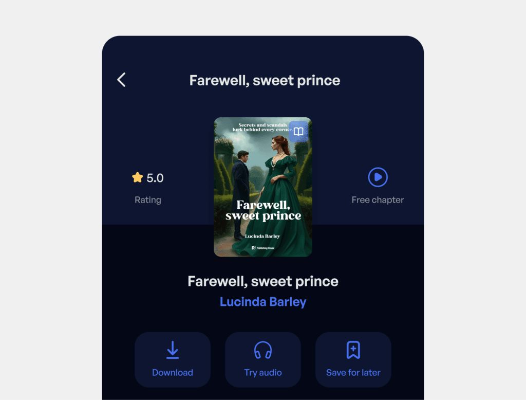
Title details. The “Free Chapter” button is placed directly next to the cover, without scrolling. Content is divided into tabs: Description, Reviews and You Might Like, so users can get to the information they need without reading everything. Ratings are visible immediately, because they genuinely influence choice.
Playback queue — visible and controllable. The playback queue is visible and lets users change the order. This addresses one of the most common user frustrations: a hidden queue and lack of series continuity.
Design system
Built with variables in Figma, which made it possible to manage colours, components and their variants from one place. I prepared a component library, typography styles, colour tokens and a set of principles to support easy interface scaling.
Outcome
The project made it possible to translate real user observations into my own design solutions, and to combine research experience with UX/UI design. I could explore what a product built from scratch might look like. Creating a complete design system as a foundation for further development was an additional value.
Looking for a UX/UI Designer?
Get in touch and I’ll deliver a useful design
aligned with your business goals!